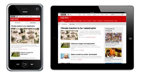
It used to be that website designers and owners only had to worry about making websites that catered to all browsers. But with a 2015 study by Smart Insights indicating that more than 80% of internet users own a smartphone, it is becoming more and more important for websites to cater to all devices. Websites designed only for PCs or laptops are less usable on tablet-sized devices and almost unusable on smartphone-sized devices. This poor user experience will translate into poor engagement and poor sales.
What This Change Means
As always, and to maintain it's market dominance, Google wants to provide it's users with the most useful search results possible. "When it comes to search on mobile devices, users should get the most relevant and timely results," Google said last week on their Webmaster Central Blog. This is why, starting from April 21st 2015 it will be placing more importance on whether or not a website is "mobile-friendly" when returning search results on mobile devices. This means that even if you ranked first for a specific search term when a user searches using a PC or laptop, your website is unlikely to even be on the first page of results for the same search term when performed on a mobile device if your website is mostly unusable on a smartphone.
"This change will affect mobile searches in all languages worldwide and will have a significant impact in our search results. Consequently, users will find it easier to get relevant, high quality search results that are optimized for their devices," continued Google's spokesperson. It is unusual for Google to announce changes to it's algorithm in advance, and especially for them to describe it's impact to be "significant". But there have already been rumors that it had started taking "mobile-friendliness" into account when ranking search results for smartphone users and users of Google Search Console (formerly Google Webmaster Tools) have started receiving warnings if their website was not compatible with mobile devices.
However, in a Google+ Hangout on April 7th, Google's John Mueller said that "brand" pages are unlikely to lose their number one position if it is still the most relevant search result, even if their website is not mobile-friendly. "It's just that these sites are often very relevant for these queries and even if they are slightly demoted then it is not going to drop them from page one or drop them, sometimes not even from the first position," said Mueller. This means is that if someone is searching for your company name on a mobile device, even if you don't have a mobile-friendly website your homepage will probably retain it's high position because of it's relevance. That said, other pages on your website for other search terms will still be affected by this algorithm update.
Do I Need A Mobile-Friendly Website?
Trends suggest that the number of searches being performed on smartphones is only going to increase. Following this update from Google, and as the proportion of searches performed on mobile devices increases, websites that are not "mobile-friendly" will attract fewer and fewer visitors from search results. We therefore recommend that all website owners consider upgrading their website to one that caters well to all devices (using responsive web design),to ensure that you are not missing out on visitors and potential sales.
If you use Google Analytics to monitor your website's traffic, you may be underwhelmed by the proportion of your users that use devices other than a PC or laptop. While it's possible that if you have a business-to-business website that most visitors arrive while they are at their desk (using a PC or laptop),it's also possible that this proportion is under-represented - perhaps your website is not being returned highly in search results on mobile devices and any visitor that does come to your site on these devices does not engage with your website, and does not become a return visitor.
Last updated: 24th April, 2015


