According to a 2013 study by Smart Insights, more than 20% of all website visitors to large ecommerce websites use a tablet or smartphone to access the internet. This means that if these websites are not designed to accommodate all screen sizes, one fifth of their visitors will find it far more difficult than others to make a purchase - inevitably leading to a loss of sales.
Whether you own an ecommerce store, a website to advertise your services, or simply a blog, it is important that you don't lose potential customers and readers by only catering to those using "traditional" ways to access the internet. Since the screen size of different devices varies so widely, websites that are built only with PC or Mac users in mind will at best be difficult to use on other devices and at worst impossible to use.
There are three principle ways in which a company can make their online services available to visitors using devices other than PCs, laptops and Macs: Mobile-Only Websites, Responsive Web Design and Mobile Apps.
Mobile-Only Websites
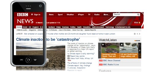
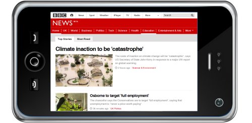
Before the invention of tablet computers and the corresponding increase in the number of screen sizes available, most websites catered to mobile devices by having a separate website that was designed solely for them. This is usually accomplished by having a separate domain (For example, "m.bbc.co.uk") that the main website redirects to when it is detected that the visitor is using a mobile device. Mobile-only websites tend to have simpler navigation and have only one column of content, and are therefore much easier to use on mobile devices than the main website.
Despite their popularity, there are some key disadvantages of having a mobile-only website:
- Because they use a different domain to a company's main website, any links to a mobile-only website will not benefit the search engine rankings of the company's main website.
- If a company wants to re-design their main website, their mobile-only website will be out-of-date unless it is also re-designed - resulting in higher costs.
- There is no guarantee that mobile-only websites created now will be compatible with phones of the future.
Responsive Web Design
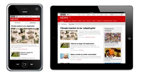
Websites that are "responsive" are displayed optimally on all devices (no matter the screen size or orientation),meaning that a separate mobile-only website is not required. Responsive website design requires that the website is built differently from non-responsive websites, with a "fluid" layout that re-organizes itself based on the screen size it is being displayed on.
There are some key advantages of having a responsive website instead of two websites (a main website and a mobile-only website):
- You only use one domain - meaning that you won't lose search engine rankings because people link to your mobile-only website.
- When you want to re-design your website, you will only have to do this to one website, resulting in lower costs.
- Responsive websites are more "future-proof" because they will cater for all screen sizes - so you don't have to worry when new devices are launched.
- Responsive website design is the approach that Google describes as "best practise", since it "makes it easier for your users to interact with, share, and link to your content, and a single URL for the content helps Google's algorithms assign the indexing properties for the content".
Mobile Apps
With over 50 billion mobile apps (an abbreviation of "Applications") having been downloaded from Apple's App Store alone since it's inception 5 years ago, there is no doubting that mobile apps are popular with users. Following the success of BlackBerry, most apps were originally for business use, but the speed with which consumers embraced the new technology resulted in an explosion in the functionality of apps - to include games, shopping, banking, location-based services and much more. But since mobile users access online services via both their browser and mobile apps, organizations that have a mobile app should always have a website too.
Conclusion
The number of different devices that are used to access the internet is only going to keep increasing. If a reasonable number of visitors to your website are using a device other than a PC or a Mac (this can be discovered using Website Analytics),your organization is probably losing readers or customers if your website does not cater to their screen sizes. In the long run, the most cost-effective and beneficial way to cater for everyone is to upgrade your existing website to one that utilizes responsive web design, regardless of whether or not your organization also has a mobile app.


