Why Website Forms?
Most website owners have specific reasons for wanting to capture information from at least some of their visitors (for example, those people interested in their services),and need to capture certain information from other visitors (for example, those people who are making an online purchase). Even if you only want to hear from people interested in your services, a simple contact form can be beneficial for four reasons:
- Simply showing your email address to send inquiries to usually results in that address being harvested by automated scripts ("spam bots") for spam purposes
- Most websites now use a database to store their content and details of their subscribers and inquiries. The use of a form allows the data being sent to the database to contain the correct type of data and for this data to be most useful. For example, when you are asked to enter your first and last names separately, this means that the website's database contains both fields, which might be useful in future correspondence.
- A form allows you to ask the visitor for the specific information you need. For example, if you would like to send a print brochure to visitors who make an inquiry, you will want to make sure that you have their full correct mailing address. You are more likely to receive this information using a form than if you were to ask visitors to simply email that information to you.
- In advanced cases, the submission of a form can represent a trackable action on the part of the visitor. This can be associated with a specific click on an online advert (such as Google Ads),allowing you to measure the effectiveness of various campaigns.
As a result of how useful they are to website owners, online forms have become a ubiquitous feature of the internet. But this relentless increase has seen the rise of so-called "form fatigue", where visitors become tired of entering and re-entering their details. Each person who views a form and subsequently submits it is referred to as a "conversion", and if you use Google Analytics you will have first-hand knowledge of the fact that not all visitors convert. Since your own website's online forms are probably the primary way in which you attract leads or make sales, if they are not conversion-optimized they can also represent a barrier to your business being successful. Optimizing your website's forms to maximize conversions should therefore be a priority.
Earn Your Visitors' Trust
When designing your online forms, it is important to remember that in most cases you are asking complete strangers to give you their personal information. For this reason, it is paramount that you attempt to reassure them by employing the following best practices:
- An online form always has a specific purpose in mind, and this should be as clear as possible to your website's visitors. Once you are clear about your form's main aim, label your form with an appropriate title that explicitly informs the user what they are doing, such as "Arrange a Free Consultation" or "Sign-Up To Our Mailing List".
- Declare to the user what you intend to use their information for, preferably with a link to your privacy policy.
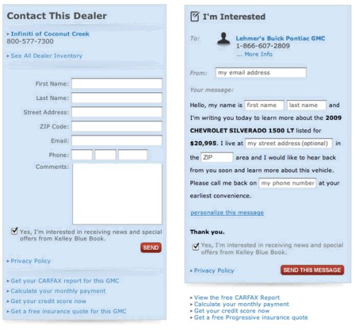
- Try not to confuse your visitors by not properly labeling your form fields. In a well-known case, online travel company Expedia increased profit by $12m a year by making one small change to a purchase form for one of it's products. They found that having a "company" field in the form was giving many users the false impression that they were supposed to enter their bank details, as apposed to their own details, which was resulting in the address being entered failing to be verified as the card-holder's. After simply removing this one field, Expedia enjoyed significantly increased conversions.
- It is a good idea to display any accreditations or certifications that your business has been awarded in or near your form. And if your website form is using Secure Sockets Layer (SSL) technology, for example if you are collecting credit card information, you should prominently display any relevant security seals.

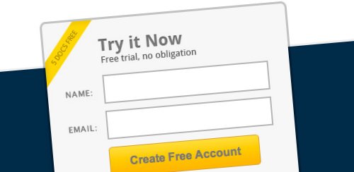
Only Ask For Necessary Information
When you are asking a visitor to your website to part with personal information, it is important to consider how they feel. Most people are hesitant to give out their personal details to just anyone, and most visitors are short of time and will resent having to complete a complicated form. Here are some reasons why you should therefore think about how much information you actually need from your visitors and only ask them for that:
- You only need one way of contacting visitors who submit an inquiry - you can get further details from them at a later date if required.
- The type of information you ask for will affect how many visitors submit your forms. Unless strictly necessary, you should avoid asking for potentially sensitive information such as age, and in most cases you should never require that a visitor submits a telephone number to you, since most people worry about receiving multiple sales calls.
- The number and type of form fields influences the conversion rate. A 2010 study by HubSpot analyzed over 40,000 form pages and found that most conversions were observed when a form contained exactly three fields, with the number of conversions decreasing slightly for every additional form field.
- If one or more of your form fields are optional, you probably don't need that information and you should ask yourself whether these can be removed completely, since the end-result will be a form that appears much simpler and quicker to complete.
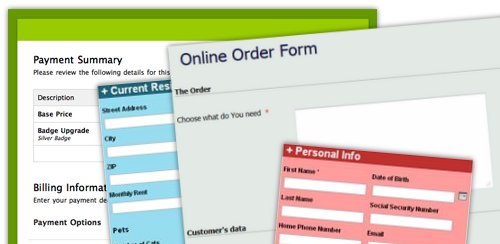
Make Your Forms Appealing
Perhaps surprisingly, small changes to the design and layout of your forms and their elements (such as the submit button) can significantly increase your conversion rate. A 2009 study by cxpartners reached the following conclusions about the layout of form fields:
- Since users complete online forms from top to bottom, forms with a simple vertical layout performed better than multi-column layouts.
- Form field labels that are left-aligned (rather than being aligned against the input fields) are clearer to the user.
- When two input fields share the same form row and label (such as first and last name fields),they should be close together so as to appear like a single piece of information.
- If your online form is broken into sections with different headers, these headers need to be emphasized in order for anyone to read them.
- Labeling optional fields is clearer to users than labeling mandatory fields with an asterisk.
- Users prefer tips about completing the form to appear at the end of the relevant field, not below it.
Multiple studies have also shown that the size, shape, color and wording of form submit buttons can also have substantial impact on conversion rates:
- A 2010 study by HubSpot of over 40,000 form pages found that forms with buttons featuring only the word "Submit" had a conversion rate of approximately 14%, and forms with buttons featuring some other wording had an average conversion rate of over 17%, with those with buttons using the words "Click Here" attaining a conversion rate of over 30%.
- A change in wording for a form's button from "Start your free 30 day trial" to "Start my free 30 day trial" resulted in a 90% increase in conversions.
- Changing from a square-cornered blue "Add to Cart" button to a rounded green one resulted in a 35% increase in conversions.

It is important to note that there are no hard and fast rules about the style or wording of submit buttons, and that different varieties will work more effectively on different websites, depending on the genre, website design and copy of each. But, if you are lucky enough to enjoy significant numbers of visitors to your form pages, it is definitely worth testing a variety of submit buttons since, as we have seen, slight changes can yield significant results.
Use Available Technology
The faster and more easily a visitor to your website can complete a form, the more conversions you will attain. You can make your online forms easier to complete by labeling each field's HTML code with the appropriate WHATWG HTML Standard data type for their autocomplete attribute. This means that when a visitor has autocomplete enabled, their browser will autocomplete each form field with the value they normally enter for such a data type when they click on it.
Everyone knows the frustration caused by forms that return vague error messages or, worse still, don't save the data you have already completed when they return an error. At the very least, your forms should therefore provide the user with polite error messages that give specific instructions about how to remedy the problem, and should always retain any information already inputted. To make form filling an even more pleasant experience, you should consider using Asynchronous JavaScript and XML (AJAX) to validate input and report errors to the user in real time. For example, when a user has completed a field appropriately, it is encouraging to them if a tick is suddenly displayed next to the field.
Completing online forms can be especially frustrating on mobile devices, with the visitor often having to switch between different keyboard options. If your website is built using HTML5, you can also make it easier for these users by labeling each form field's HTML code with the appropriate input type. For example, when a form field is labeled with the "email" input type, the user's device will automatically display the buttons commonly used for writing email addresses (such as "@" and ".com").
Think Differently?
As online forms continue to be more prolific, some designers have taken to designing forms that look less and less like conventional web forms with a view to further increasing conversion rates. In one example, Vast.com designed a form for a car dealership in the style of the Mad Libs word game, resulting in an average increase in conversions of 25-40%:
While less-conventional forms wouldn't suit all types of website, we are likely to see more forms like this as designers embrace the increasing possibilities of HTML5 and CSS, and attempt to make their forms more appealing to users.